Interior design colour theory
Everyone loves a neutral colour palette. There’s a reason all-white everything is a popular decorating aesthetic everywhere from interior design television shows to Instagram #inspiration hashtags. When you’re working with neutrals, everything coordinates with ease. But experts say that this crisp, clean look is falling out of favour with many home design enthusiasts, and that bright, bold colours are back in style.
Now, if you love the all-white look for your kitchen, bedroom, or anywhere else in your home, it doesn’t matter what ‘the experts’ say is on-trend. Your house should be a space that’s suited to you, not to social media or magazine photoshoots. But if you’re curious about colour, it might be time to add some brighter hues back into your interiors.
When thinking about colours for your design strategy, using colour theory is a great way to decide which colours to include, which hues go well together, and more. Read on for our guide to colour theory basics that you can utilize to bring gorgeous hues to your home.
Begin with basics: the colour wheel
Everything begins with the colour wheel. There are three types of colours on this wheel: primary, secondary, and tertiary. The primary colours are the three colours that cannot be created from other colours—red, yellow, and blue. Combine any two of these colours and get the secondary colours (red + yellow = orange, blue + red = purple, yellow + blue = green). And the tertiary colours are the secondary colours + one of the primary colours: red-orange, yellow-orange, yellow-green, blue-green, blue-purple, and red-purple.
We know that’s a lot to take in, so let’s focus on how we can use this to choose the perfect paint and furniture colours for your home. Start by choosing one colour that really catches your eye. 
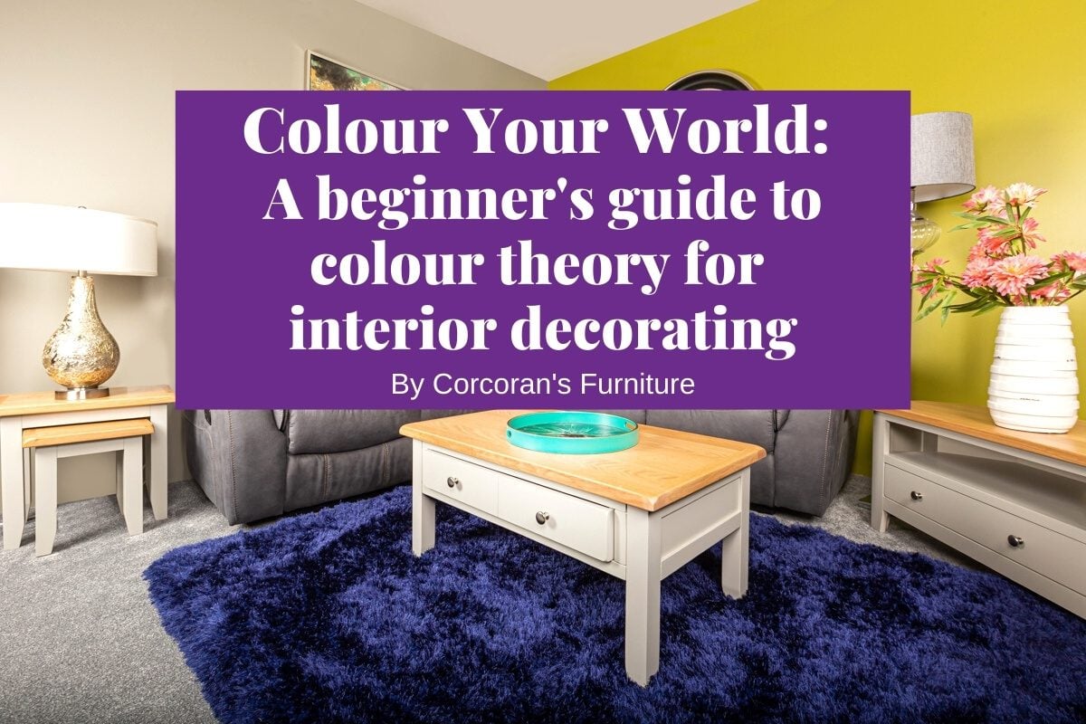
Whether you’re going all out and changing up the colour of your walls, or going for a neutral overall theme with a bold pop of colour from a sofa or bed, you can base your room’s look around this colour and choose accents according to colour theory.

via wikipedia
Better together: colour schemes
Complementary colours are opposite each other on the colour wheel, so red and green, blue and orange, and yellow and purple. Colour theory says that these colours go well together. Now, this doesn’t mean you need to deck out a room half-and-half (unless you want it to feel like Christmas year-round, a bold red and green room probably isn’t the way to go), but you can use these complementary pairs to inspire accents in a room with one main hue.
But complementary colours aren’t the only way to choose a colour scheme. An analogous colour scheme comprises colours that sit right next to each other on the colour wheel, and are perfect for creating a monochromatic look. Then there are triadic colour schemes. These pairings of three colours that form a triangle on the colour wheel (think all three primary colours), are ideal if you want to go extra bright and bold.

Shades of red and green bring a complementary colour scheme to this living room featuring the Junior suite and Sorgeal range
Turn up (or down) the heat: warm and cool undertones
Colour theory divides colours into warm (reds, yellows, oranges) or cool (blues, greens, purples) undertones. Keeping consistent undertones across a space can help to create a coordinated look, especially when you’re adding in other materials like woods and metals. For example, if you’re giving your bathroom a cool-toned look with blue or purple walls, sticking with fixtures with cool-toned finishes like polished chrome or stainless steel will effortlessly blend, while warm tones like bronze and rose gold work better with yellow or pink walls.
Other materials can have warm or cool tones as well. Think cherry or mahogany wood for warmer spaces, and ash wood or stone like marble for cool-tone rooms. That being said, you don’t want a room that is entirely decorated with cool or warm tones (especially cool tones—as you don’t want it to feel cold). Accent a warm-toned room with cool colours and vice versa. It’s all about balance!

A cool-toned grey and blue colour palette brings peaceful calm to this bedroom featuring the Maxwell range
Feeling it: the psychology of colours
When you’re choosing colours for your space based on colour theory, think about how you want to feel when you’re in a room. Different colours are associated with different characteristics, and colour theory helps us choose ideal hues for our walls and furniture based on the feelings they evoke. You can learn all about colour meanings in this guide by House Beautiful, but here’s a quick look:
- Red: passionate, exciting, energetic
- Blue: strong, introspective, reliable
- Yellow: cheerful, friendly, spontaneous
- Green: lively, healthy, restorative
- Orange: fun, optimistic, charismatic
- Purple: creative, dramatic, meditative

Yellow is both comforting and energising, perfect for a cheerful and cosy sitting room. Read more about styling with yellow in our previous blog post here
Lighten up: tints, tones, and shades
As you read this, you might be picturing a vibrant room full of intense colour, and if that’s your style, great! But you can also use colour theory to create a softer, more subtle look with tints, tones and shades. But what exactly are they? Tints are colours + white. Light blue, pink, pastel yellow, and so on are all tints. If you love orange but are looking for a more peaceful colour for a relaxed space, opt for a tint like peach or apricot for a less in-your-face look.
Shades on the other hand are colours + black. These darker colours are deep and moody, ideal for a dramatic space. Tones are similar in that they are colours + grey, creating muted looks that add a subtle dash of colour to a room.

Red and black may seem too overbearing for a bedroom, but pink and grey make for a perfect pair, featured here with our Clifford range
Your home rainbow: pulling it all together
Whether you’re adding a pop of colour to your neutral space or going bold with a spectrum of hues, colour theory can help you choose the perfect tones for any space. We hope you can use this guide to inspire your interior design, but if you’re feeling overwhelmed by tertiary colours and triadic colour schemes, get in touch today! Our team here at Corcoran’s includes experienced interior designers who can help you create a home decor colour palette that offers a perfect look and feel for your home.