Colour of the Year 2022
We all know that colour psychology can be an important element of interior design and home decor. Whether you want an energising red space or a restorative green room, the colours you choose for your walls, furniture, and more can set the tone for your day.
In the same way, each year Pantone, a company most known for its standardised colour matching system that is used across industries ranging from graphic design to fashion to home decor, chooses a colour that they say will set the tone for the year to come.
Pantone’s colour of the year 2022 is Very Peri, a lovely shade of periwinkle blue with red undertones that they say ‘encourages courageous creativity and imaginative expressions’. Designed for ‘rekindling gratitude for some of the qualities that blue represents complemented by a new perspective that resonates today,’ Very Peri is intended to offer the calming presence that blue provides while adding a burst of energy to help get your creative juices flowing.
Although it’s a beautiful hue, Pantone’s colour of the year 2022 isn’t the easiest to incorporate into home decor. Unlike last year’s Illuminating and Ultimate Grey pairing of a bright, sunny yellow and light, neural grey, we don’t see too much of this shade of purple-blue in interior decorating. However, there are still plenty of great ways to add a touch of Very Peri-inspired purple-blue to a room.
Add an accent
If you’re all about keeping up with the trends, you’ll probably want to change out your colour of the year 2022 furnishings when the colour of the year 2023 rolls around. Therefore, unless you really love the colour, you probably don’t want to repaint all your walls and swap out all your furniture.
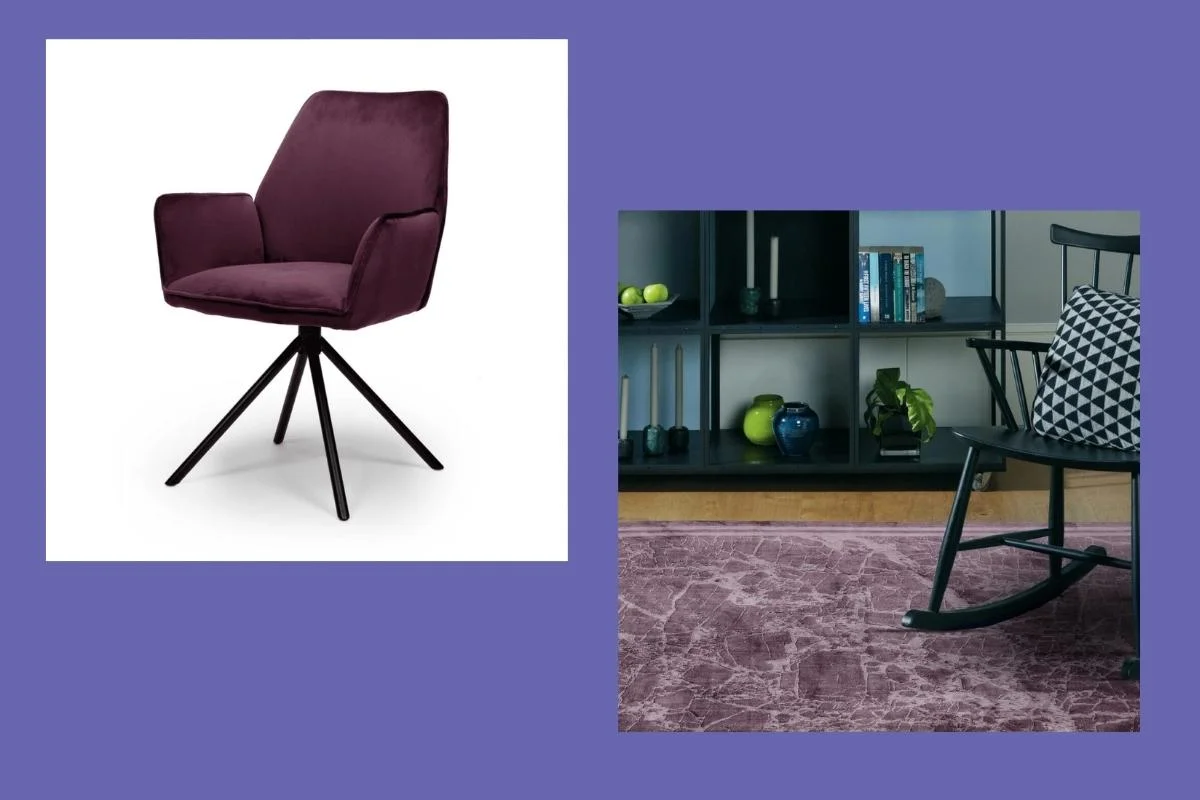
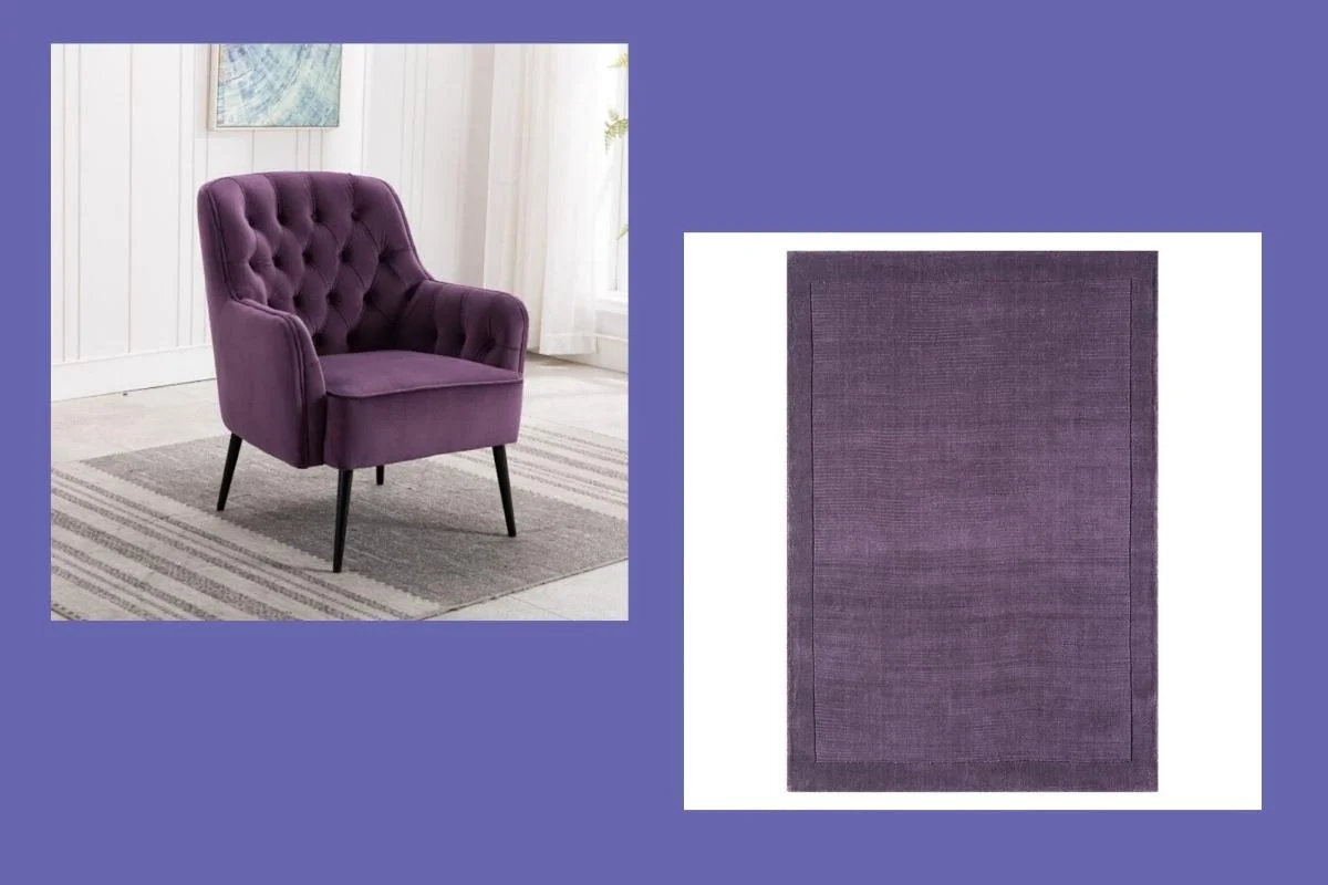
Instead, use the colour of the year 2022 to accent your existing space. A purple rug or small armchair can bring a pop of colour to a room without taking over the whole look. Purple wall art is another fabulous option — with a hue that is designed to inspire creativity, what better way than to use it in your artistic accessories?
Pair it with texture
Purple was traditionally considered to be a colour for royalty, and it’s still associated with sumptuous, luxurious home decor and styling. While Pantone’s colour of the year 2022 can be utilised on flat, untextured surfaces like walls, it’s even better when combined with a piece that brings textural interest to a room.
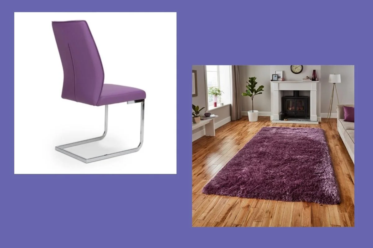
If you’re looking for the right texture to fit with a regal purple tone, velvet definitely has to be high on the list. Lush, soft, and smooth all at once, purple velvet, especially when detailed with other textural elements like button-back upholstery, makes for an elegant addition to any room. Similarly, a high-pile shag rug in an opulent purple hue can make your home extra palatial.
Bring surprising style
Pantone’s colour of the year 2022 is the first time that the company has created an entirely new colour to represent the year to come, rather than choosing an existing colour in their collection. This unexpected move is meant to show that we are emerging from a difficult period into a hopeful and expansive future. Similarly, if you want to add this colour to your home, you may want to consider using it in an unexpected way.
Accessories and soft furnishings like bedding or throw pillows are a great option, but also an obvious one. Why not consider a surprising use of colour like adding purple dining chairs or a bold bathtub? Or, instead of a traditional accent wall, try painting the ceiling instead to create visual interest in a unique way.
Other options for the colour of the year 2022
Maybe Pantone’s Very Peri has you inspired, but maybe it’s just not quite what you’re looking for when it comes to refreshing your space for the new year. Here are some other brands’ picks for colour of the year 2022 that you may want to consider as you plan your interior decor projects for the year to come:
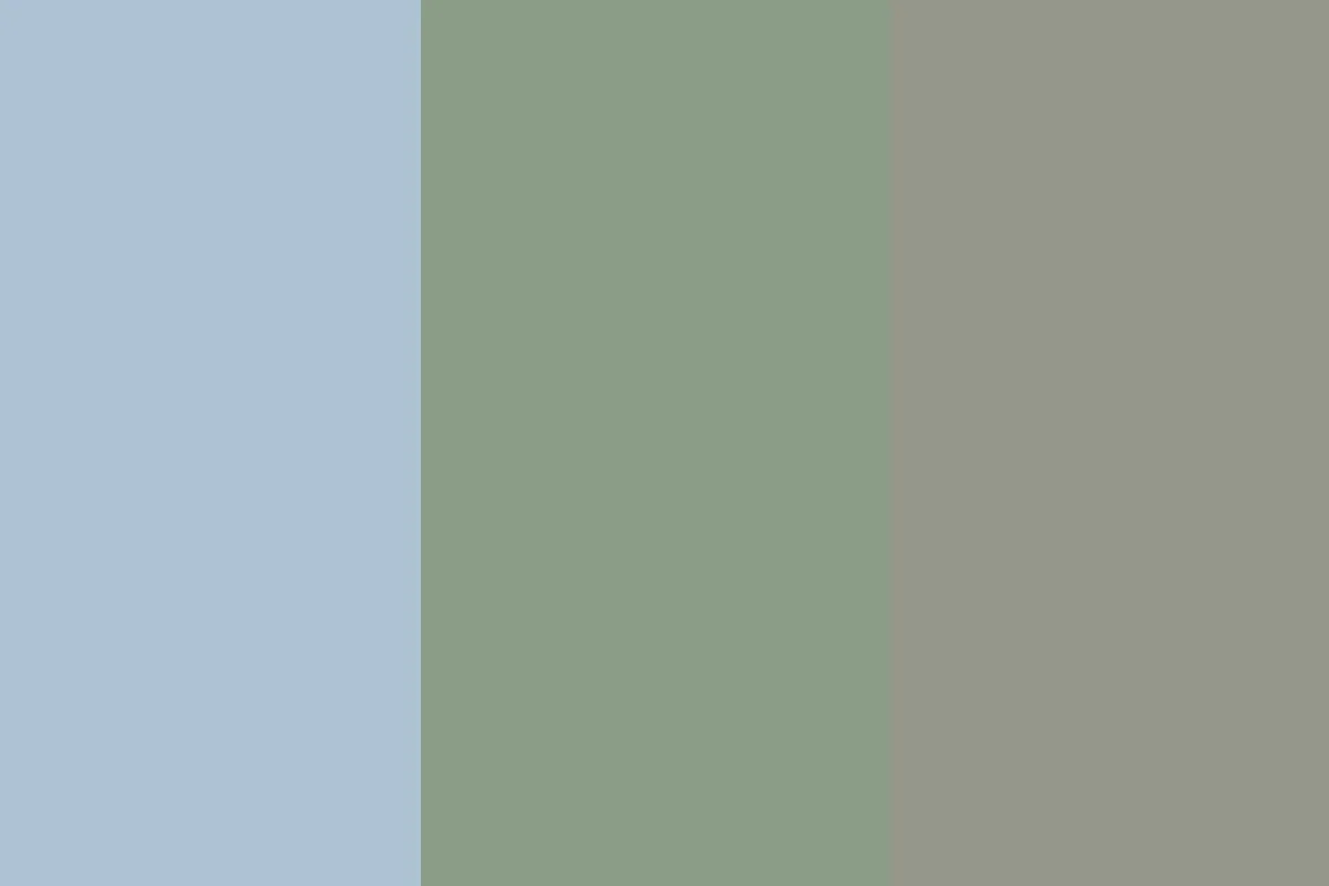
- Bright Skies (Dulux): A sky blue that is light enough to be considered a neutral, this colour choice from Dulux is designed to ‘open up and breathe new life into any space.’ This soft, sweet blue is a perfect pick for the walls of any room, and pairs well with neutrals and brighter colours alike.
- Laurel Leaf (Better Homes & Gardens): The interior decorating magazine Better Homes & Gardens chose this soft green hue to ‘reflect a renewed desire to incorporate elements of nature into our homes.’ It’s a lovely pick for an organic home full of creamy neutral and light-to-medium wood tones.
- Evergreen Fog (Sherwin-Williams): American paint company Sherwin-Williams picked this grey shade with hints of green and a touch of blue, calling it a ‘simple but sophisticated’ choice for rooms that ‘crave a subtle yet stunning statement’. It would look equally beautiful as wall paint, tile colours, or even painted furniture.
Start the new year in style with Corcoran’s
Use the colour of the year 2022 to inspire your home decor projects going into the new year, and visit your nearest Corcoran’s or shop online to find the perfect pieces to add into your space. We also have a fabulous range of paints by Little Greene, plenty of accessories, and everything you need to complete your interior design dreams in style. Choose your colour palette, or let us help you find the best hues for your home, and set the tone for your space with the Corcoran’s range.


